studioutte takes its name from combining “studio” + “utte”, which as co-founder Patrizio Gola explains, is an alteration of “hut”, or a shelter. Though it’s not a term that exists in Italian, it’s a play on designing interior spaces – which is the premise of the studio’s work. Together with co-founder Guglielmo Giagnotti, the pair work on interior projects for private and commercial clients, while also designing a collection of furniture items that are handcrafted by craftsmen local to Milan, where studioutte is based. The studio was founded in 2020 after Gola and Giagnotti had separately worked in architecture and interior design, the former working with firms in Milan, including Dimore Studio, mainly conceptualising hospitality spaces. Giagnotti, meanwhile, worked for over three years with the architect Vincent van Dysen in Antwerp. Later, after Giagnotti moved to Milan, the duo first met, working together for a few months; while a subsequent project led to the decision to combine expertise and ideas through studioutte.
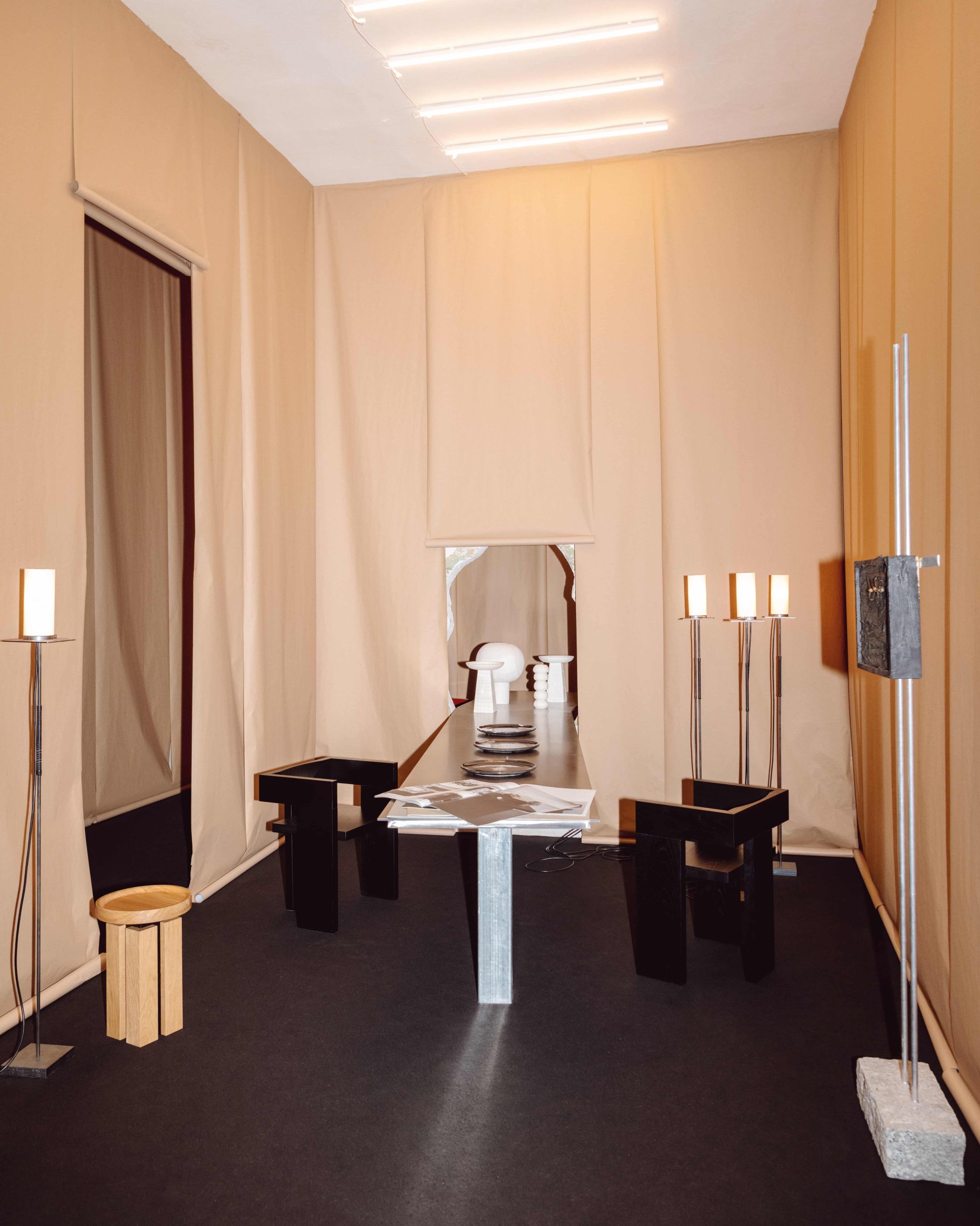
Since founding the studio, Gola and Giagnotti have collaborated with Los Angeles-based curator, Alexander May. In 2022, they also exhibited some of their furniture pieces, as part of the Industrialism group show at the former Donna Karen showroom in New York. Earlier this year, Gola and Giagnotti took part in Milan’s Design Week festival. For the show, they covered their designated exhibition space in 250 metres of craft paper. The intention, Gola explains, was to “cancel [out] the existing architecture and to pay homage to ephemeral architecture.” While the duo played into the notion of the temporary space, they also designed a site-specific iron table to exhibit alongside their collection of furniture items.
When it comes to the concept behind the furniture that studioutte designs, both Gola and Giagnotti emphasise the importance of using natural materials – materials that age over time and become part of their clients and customers lives forever. “There’s a timeliness in the sense that it will stay with you,” Gola says. They started out with a design for a chair, the ert chair, which encapsulates the kind of “purity and simplicity” that informs their design approach: it’s made over seven planks of wood with a carved, half-moon shaped backrest. “So it’s just seven simple planks that actually create a very sculptural chair,” Gola explains.
As for the ethos that underpins studioutte, Giagnotti explains that their work is very much rooted in an Italian design tradition. “People [tend to associate] us with a new wave of minimalism,” he says, “but, for us, there’s no wave in the way of composing and designing. It’s [more of] a vernacular simplicity [that comes from] ‘90s Italian design.” studioutte is, therefore, not a studio that seeks to follow trends, but rather, as Gola and Giagnotti explain below, about responding to, and accentuating, the beauty of design where it already exists.
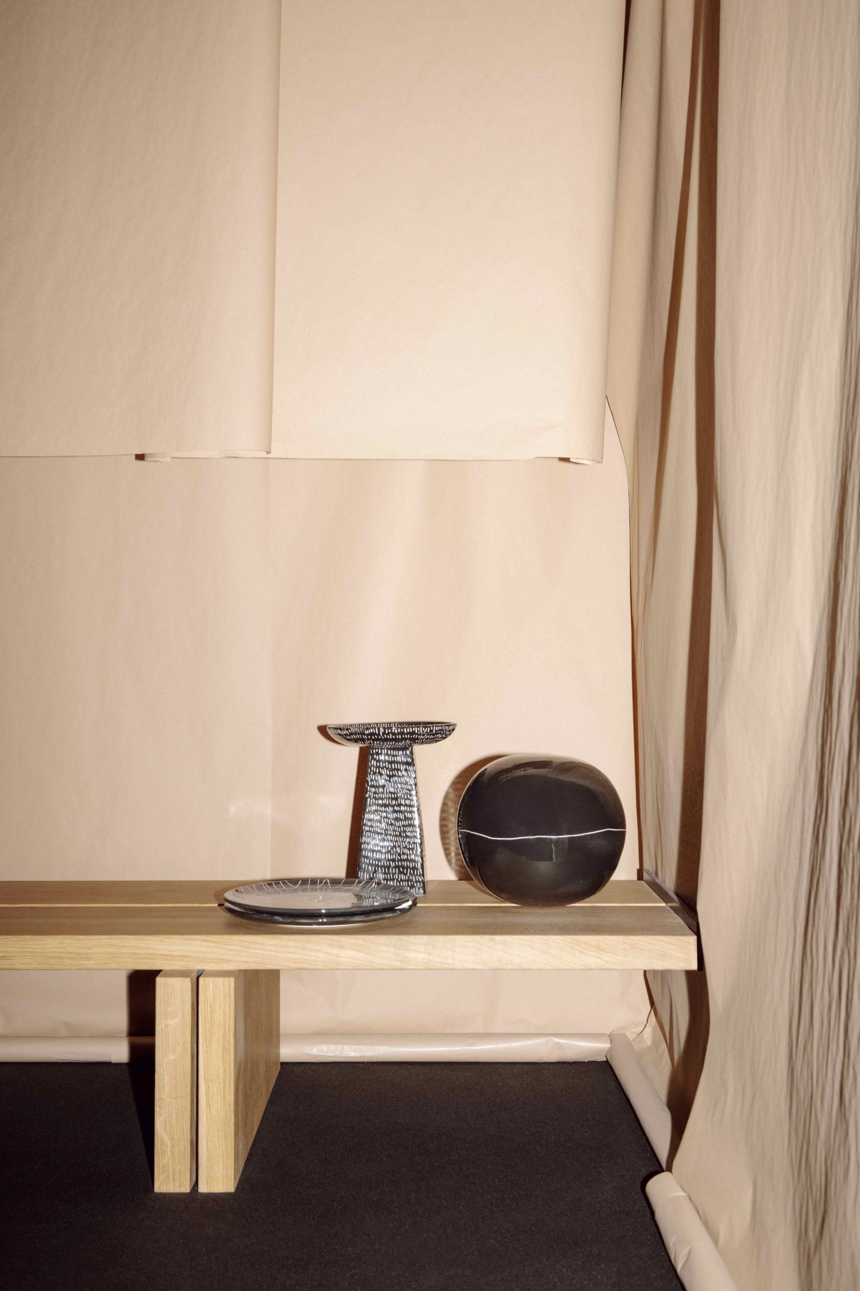
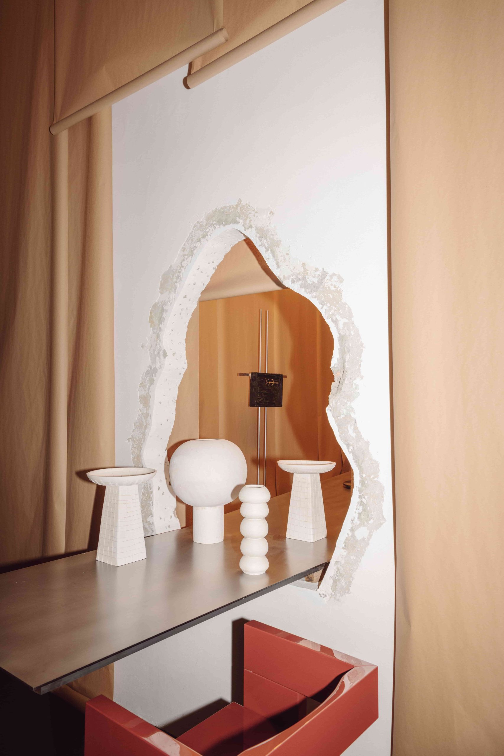
The studio started as a furniture project on paper. We had the opportunity to work on a project in Munich, Germany, and that was actually our first project, where we combined the design of the interiors with the design of furniture pieces that became part of our first studioutte collection. It was a very natural process; designing furniture for a specific space, but designing pieces that can also have a life outside of that project.
We’ve experimented [with materials] a lot because the idea behind the studio was to experiment with a warm minimalism with its roots in vernacular architecture. So we were keen to use natural materials such as solid wood, raw metal and so on. More recently, we’ve also explored a more, let’s say, Italian technique using polyester lacquer. With the prototype of our ert chair , instead of working with solid wood we used plywood coated in layers of polyester lacquer. This year, we presented an armchair based on the ert chair with an upholstered cushion. With everything in the collection, we design the prototype and then work with craftsmen in Italy: for wood objects, we go to Padova, the metal is not far from Milan and our pottery objects are produced here in Milan – which we visit regularly to engrave the pieces by hand. So it’s a very manual and tactile process.
We take a completely holistic approach [to our practice], and there is no separation between the furniture and design because what we do, in terms of furniture, is extremely architectural. We consider the furniture to be smaller architectural objects that are part of a bigger landscape. As an example, our latest prototype for a lamp is called “Straal” which, in Dutch, means “beam”; it’s built like how a beam would function and so [the shape] is already there in architecture.
That’s the aim, but it’s also not even an aim. It’s just something that is naturally pretty Italian, to be honest, or pretty old school Italian.
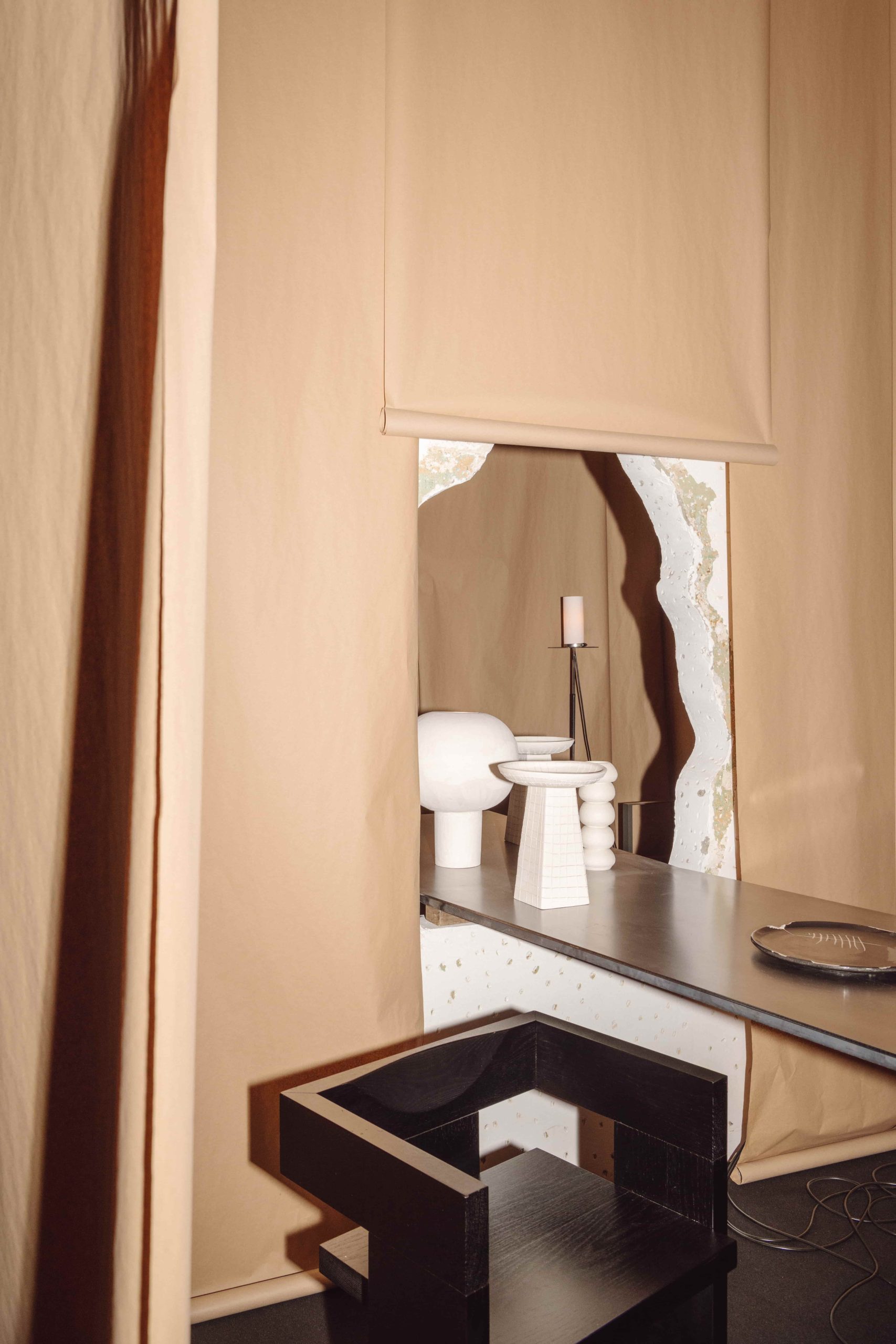
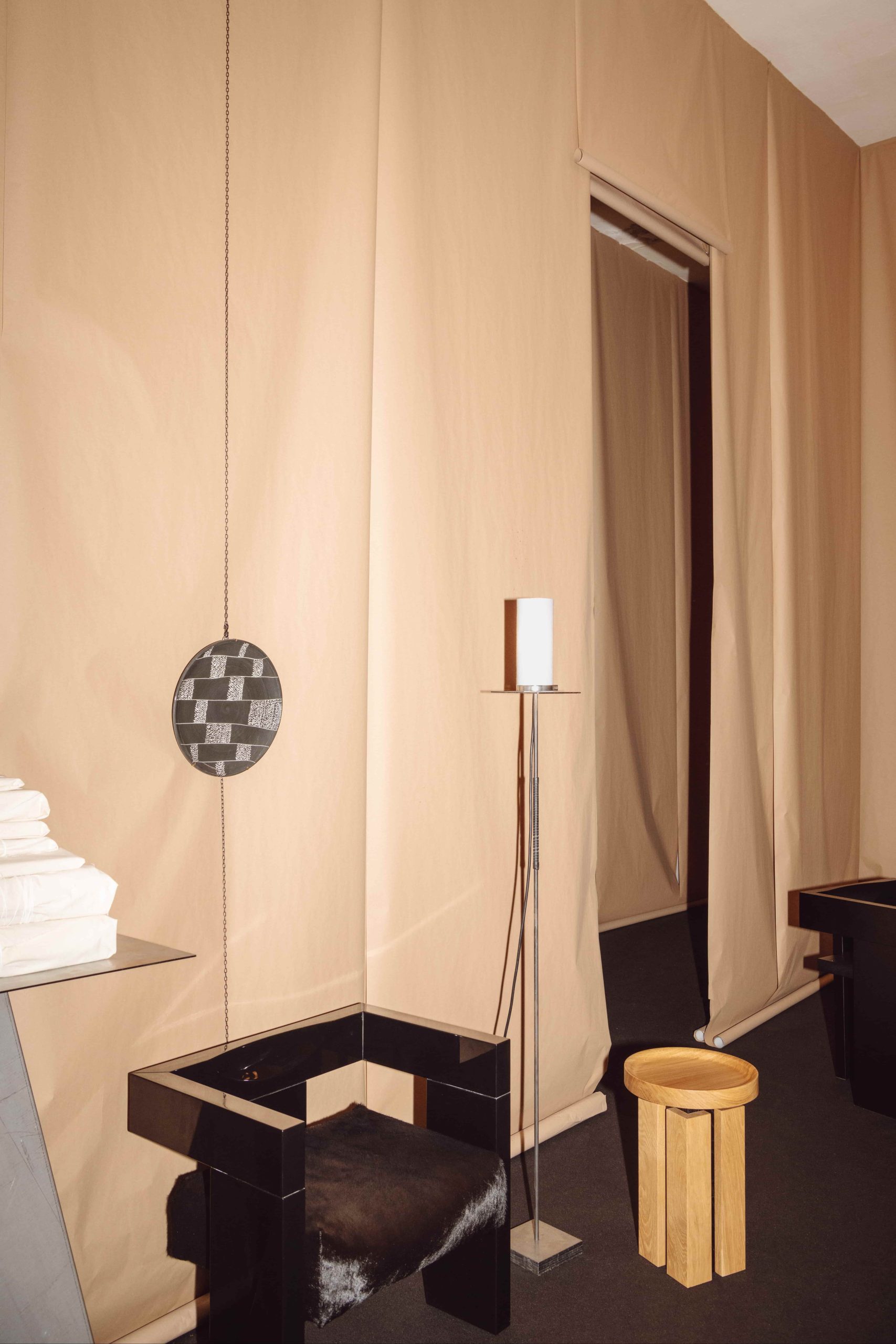
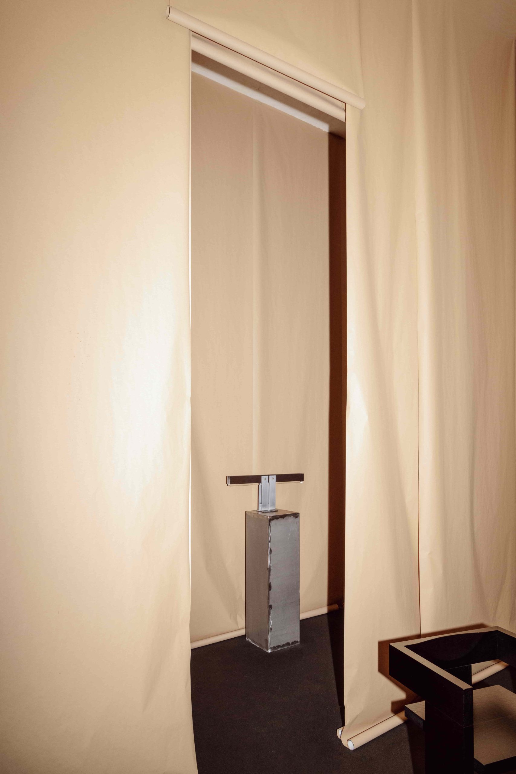
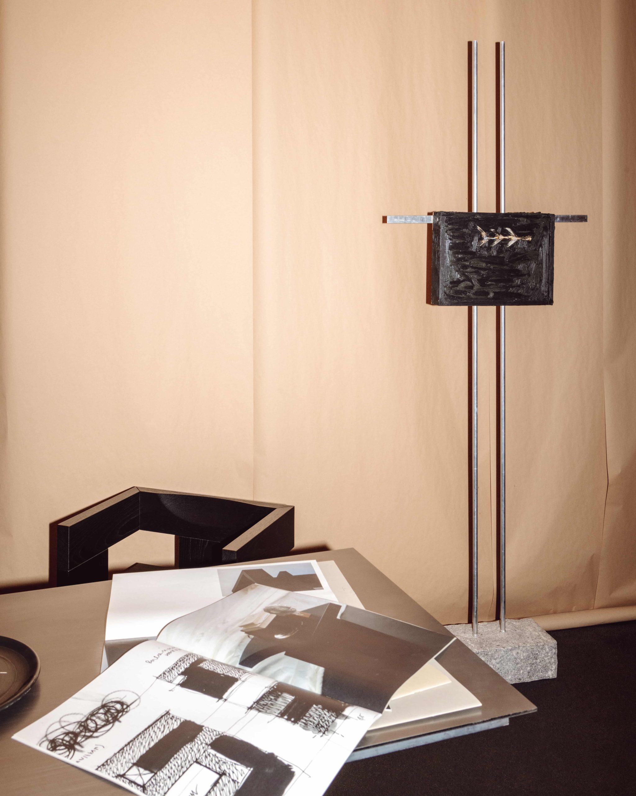
[There’s this idea of the] “genius loci”, which means the spirit of the place. So first, before anything else, we think about the place we’re in. And then, there are several rules that we stick [to], in terms of the space, layout, function. But the space [also] speaks for itself. One of our projects was on a 1930s apartment. Unlike [many] apartments in Milan which have large open living rooms and visible kitchens and so on, because this apartment was from the 1930s, it worked in terms of the distinct rooms. We added little minimalism and a little modernism while respecting the original spirit of the place (keeping the original door frames for example). For another apartment, also here in Milan, the approach was completely different because it was on a ground floor and developed around a private courtyard. The space was already open and more fluid, so we embraced that fluidity, and took a more contemporary approach. So, it always depends on the context and the surroundings, as well as the history of the place and the client’s background, too.
We never apply a specific aesthetic. As Guglielmo was saying, of course, we have precise rules, but they are rules about how to read the space, and how to create a response to that. It’s never a copy-paste of a specific material or logic of the space; it’s the space that tells us how to behave within it.
There is a huge difference between doing a project for retail or hospitality and residential because with the latter you have to understand their way of life; their lifestyle, or even the relationship between a couple. So it’s really about entering the private world of that person. You have to be more careful in terms of expressing how a space should feel, or which pieces of furniture you select.
Now that the studio is growing in terms of the number of projects we’re working on, there’s less time to dive into furniture development – but we do want to continue growing this in order to keep this holistic approach that we mentioned earlier. We’re really attached to what we do, and we really care about every detail [because] everything is created by us two. We’d like to keep this level of control, so this is a challenge we need to consider as we grow.
When we design new pieces it’s often because we feel there’s a need for something as part of that space. Say for instance that we feel that a space should have a specific lamp; it feels natural and makes more sense to design a lamp specifically for a project [rather than source one from elsewhere]. We always try to also design something for each project because it adds a greater level of sophistication to it, it makes the project “unique” in a way. We combine our bespoke furniture with a selection of vintage objects, too. So, we always try to achieve a balance between something specifically designed for each project, with something that has a raw minimalism to it [with pieces that fit the space].
It felt great to finally have the chance to show our pieces in a space that we’ve designed (so far, we’ve only showcased pieces within the context of a group show). We try to be curators of a space, because curation is very important for us. You can design the most beautiful chair, but [situated] in the wrong interior or within the wrong context, you’ll have a completely different look and feel to the chair. With the Design Week show, it felt so natural to finally see what we first envisioned when we started studioutte – seeing the furniture in the space. So we will try to keep going in this direction, because the idea is to dismantle the exhibition space and display our furniture in a permanent showcase.
The response from the public was also very positive. It was a chance for them to finally see the pieces in the proper space and to understand how they’re built [rather than] just seeing them through images. It’s important to try, to test, to see, to touch the pieces because they’re very tactile. The most common feedback we get is that, “Oh, the chair looks so uncomfortable, but actually it’s comfy,” which tells you a lot about the importance of actually touching an object, and the tactile experience of it. What we feel with the eye is something completely different to what we feel when we touch.