Sat around a large white desk in a discreet alcove of his studio, the architectural designer John Pawson is leafing through a stack of the Italian design magazine, Domus. The issues in question all date from the 1970s and were read in the library by a teenage Pawson on visiting Newcastle art college. The copies that he has brought out to show Present Space, meanwhile, were a 70th birthday present from a friend who had gone “to huge lengths to find them,” he says. The gift holds sentimental importance for Pawson, who recalls first discovering the work of the Japanese architect Shiro Kuramata in these copies of Domus and “experiencing profound feelings of recognition. Other than Mies van der Rohe, he was the first architect and designer whose work made sense to me.”
It is not hard to see why Kuramata’s visionary approach would have such a significant impact on a young Pawson; the former’s explorations of form and function led him to design everything from a short-lived nightclub in Tokyo inspired by the American artist, Donald Judd (Club Judd), to stores for Issey Miyake, and furniture. Pawson’s architecture firm, after all, has designed everything from the flagship Calvin Klein store in New York, to the interiors of the relocated Design Museum in London.
In late 1973, Pawson left England—where he had been working for his family’s textile manufacturing firm—for Japan. It wasn’t a move inspired by Kuramata per se. Rather, Pawson had seen a documentary on Zen Buddhist monks and had been inspired. “So I thought, well, I’ll do that. That’s the answer,” he recalls. “Off I go to Japan. And I went on Christmas Eve and it all was very exciting. Of course until I got there and then, the reality.”
The reality was that Pawson was dropped off at the Eihei-ji temple in Fukui Prefecture in the evening by a friend, and by morning the next day had already realised it wasn’t his calling. “I thought, what on earth am I doing? So, 10 years or 20 years or a lifetime became, you know, a few hours.” His friend, predicting such a change of heart might occur, had stuck around to pick him up. But this wasn’t the end of Pawson’s time in Japan: he went on to teach English at the Nagoya Business School, for example. Later on, in Tokyo, Pawson found a monograph of Kuramata’s work in a shop, and managed to acquire the architect’s telephone number, which he wrote on the title page of the book.
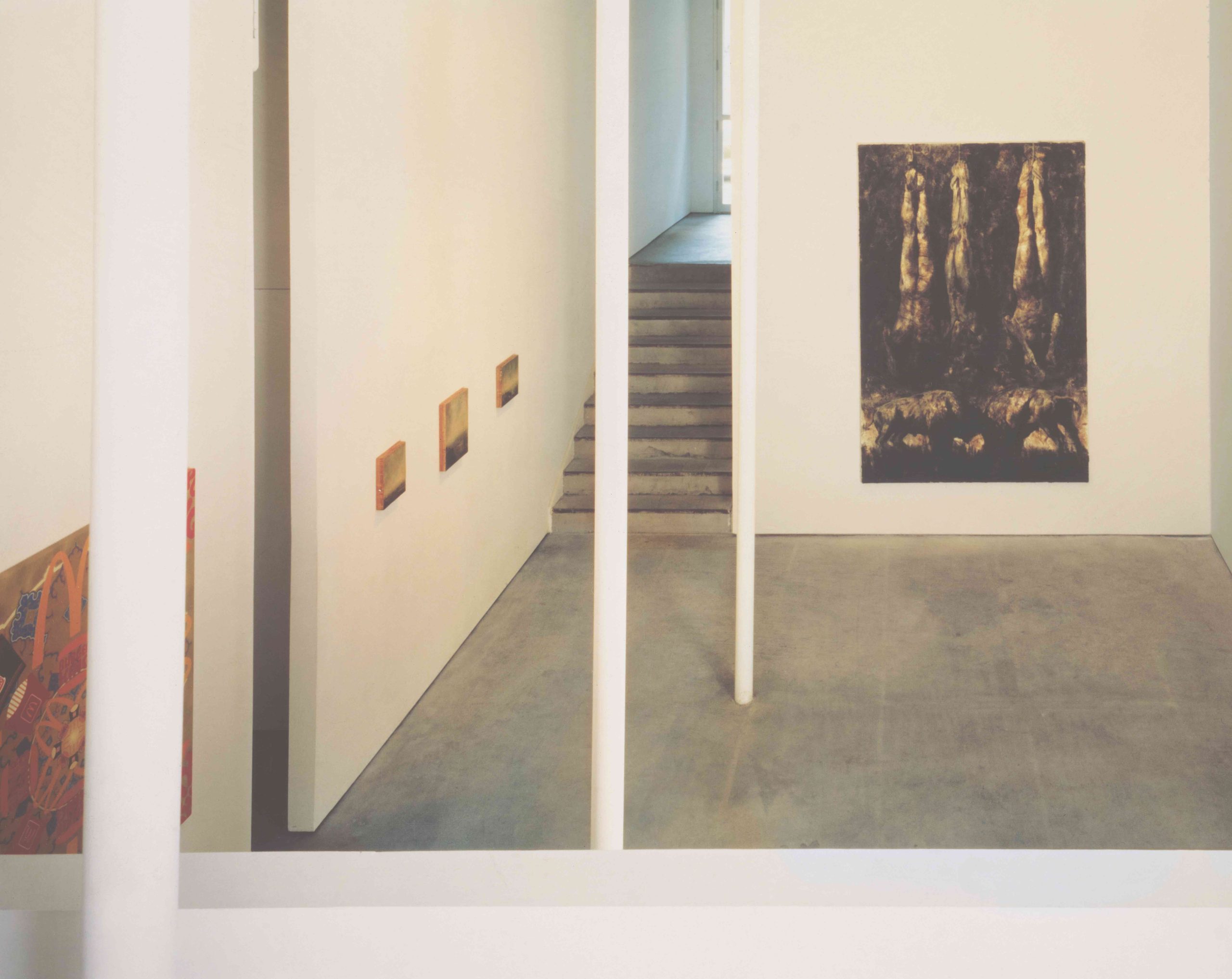
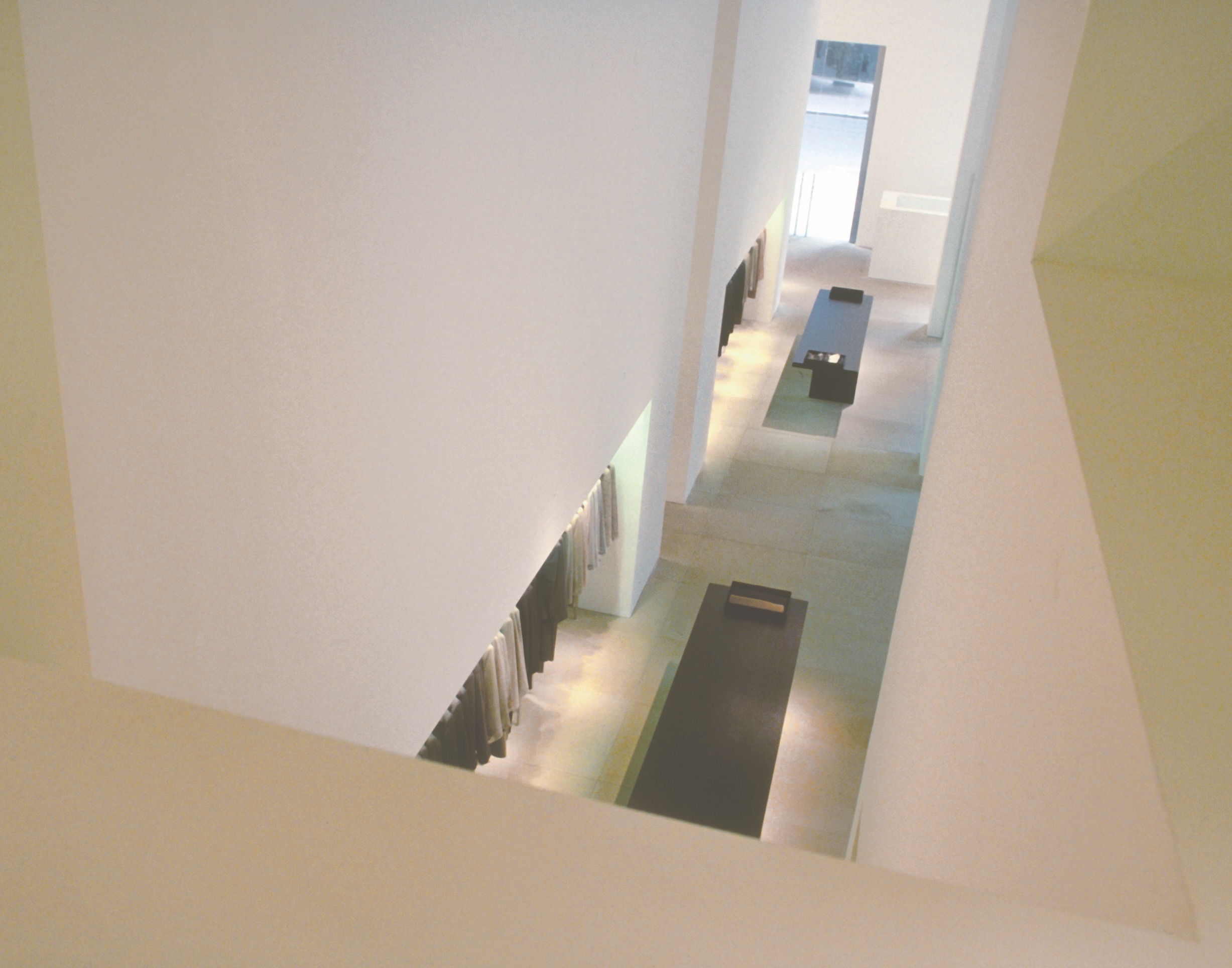
After a phone call, Kuramata agreed to meet Pawson, who recalls that he then “spent as much time in his company as I could.” Pawson accompanied the architect to sushi bars and other spaces that Kuramata had designed, including his home (pictures of which were also published in Domus). The influence that Kuramata had was wide ranging: “he taught me the value of discipline and hard work. What I admired most was [his] ability to take the everyday and transfigure it into something that was simultaneously new and familiar. I was also influenced by his desire to do everything—to be a sculptor and an artist.” Six years after Pawson had first arrived in Japan, he was advised by Kuramata to return to England and study at the Architectural Association in London, in order to become an architect in his own right.
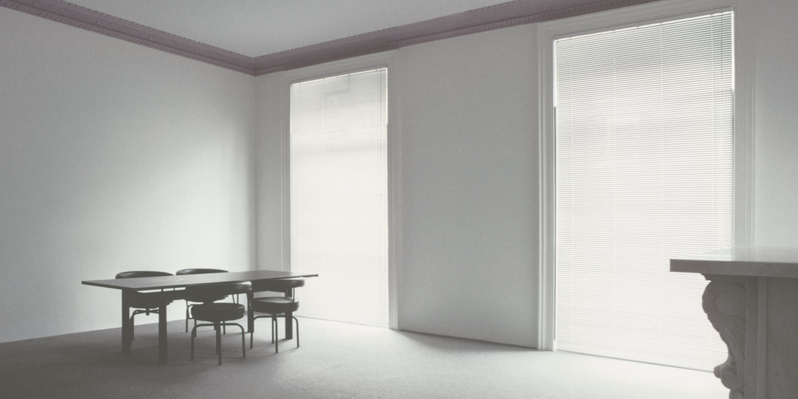
Pawson’s stint at the AA was brief (he soon dropped out) but by 1981, he had completed his first project, designing a flat in a Victorian terrace house in west London. Its pared back walls and minimal interiors would mark the beginning of a design philosophy that have continued to inform Pawson’s work ever since. While the “scale and vocabulary” of his approach to design has changed over time, he says that the “underlying thinking remains the same. There is an unbroken thread running through everything I have done. It’s a meticulous process of paring away and then focusing on getting every detail of surface, proportion, junction and light right.”
In early projects such as the former Wakaba Restaurant in London (1987), the frosted glass front arches from the street front towards the interior of the space, in a manner that recalls Kuramata’s experimental approach to store design in Japan. In the early 1990s, Pawson was approached to design the now closed Calvin Klein store in New York in the building of a former bank. The bare white walls and minimal display that Pawson envisioned for the space ushered in a new approach to retail design, one that has been replicated far and wide (think, for example, of the Apple store design approach).
But perhaps the biggest, and unexpected, project to come in the wake of Pawson’s Calvin Klein store was a commission to design the Abbey of Our Lady of Nový Dvůr, a Cistercian Monastery in the Czech Republic around the turn of the millennium. “One day out of the blue,” Pawson recalls, “somebody rang up and said, ‘We want you to design the monastery.’ I thought it was a practical joke because who gives you your ideal project?” But there was no joke to be had: the monastery had seen the Calvin Klein store in Minimum, a 1996 book by Pawson on the philosophies of a minimal design ethic, and it was something that chimed with the client.
Like the studio’s design projects, Pawson’s publishing history is rich and varied, too. He has worked on two cookbooks—the most recent of which, Home Farm Cooking (2021), was written with his wife, Catherine, and is inspired by the recipes that she makes and loves, at their converted farmhouse in Oxfordshire (designed, of course, by Pawson). Making Life Simpler, released in mid-2023, meanwhile, was written by the curator, architectural critic and museum director, Deyan Sudjic, who has been a long-time professional collaborator and friend. The premise of the book, Pawson says, was to “create a visual biography that would draw on the entirety of my life and work to date. From my point of view, every new book represents a fresh chance to communicate the work and the thinking. At the same time, each book offers an opportunity for inward assessment, appraisal and reflection.”
Asked whether he is motivated by the challenge of pushing the boundaries of what he has already accomplished, Pawson smiles and notes that “most people don’t get to design Trappist Cistercian monasteries every day.” There have been subsequent monasteries, as well as churches, including the renovation of St John at Hackney Church, “and houses, lots of houses.” But there have also been ballet sets at the Royal Opera House in London and the Opéra Bastille in Paris. “I always like to do something new if possible. It’s a much bigger learning curve,” Pawson says.
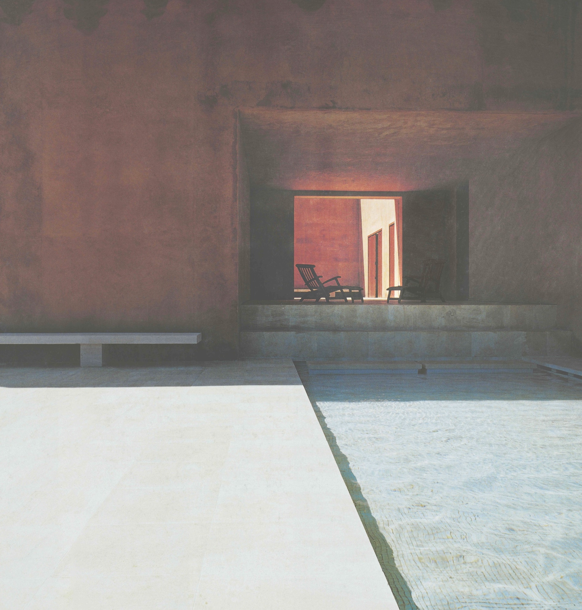
The challenge of working on something new can be evidenced at Neuendorf House in Mallorca. The project, designed between 1987–1989, was something of a blank slate, Pawson says, because it was the first house, and first architectural project, that he had worked on. Working with the Italian architect Claudio Silvestrin, the duo strove to subvert the very definition of the home. “We didn’t want to have something that was recognisable as a house in terms of the front door, like a face: the front door and then the two windows,” Pawson says. “And so, we went to a huge amount of trouble to hide the windows and have a courtyard that would allow you to enter, and then see the normal things.” But it is the exterior—high concrete walls, pink from the pigment of local soil used to complement the surrounding natural environment—that give Neuendorf House its sense of calming awe. There is little wonder that it is often featured by design websites and journals, and photographed again and again.
And yet, perhaps some of Pawson’s best-known projects have been those for which he has been his own client (many of his popular Instagram posts, for example, are shots of his home). In the 1990s, he redesigned the full interior of his London home while retaining the Victorian terraced facade. The house is oriented around space and light, with a glass window between the kitchen and garden that bridges the divide between the interior and exterior in a manner reminiscent of Mies (the kitchen worktop continues into the garden, giving the illusion of uninterrupted space).
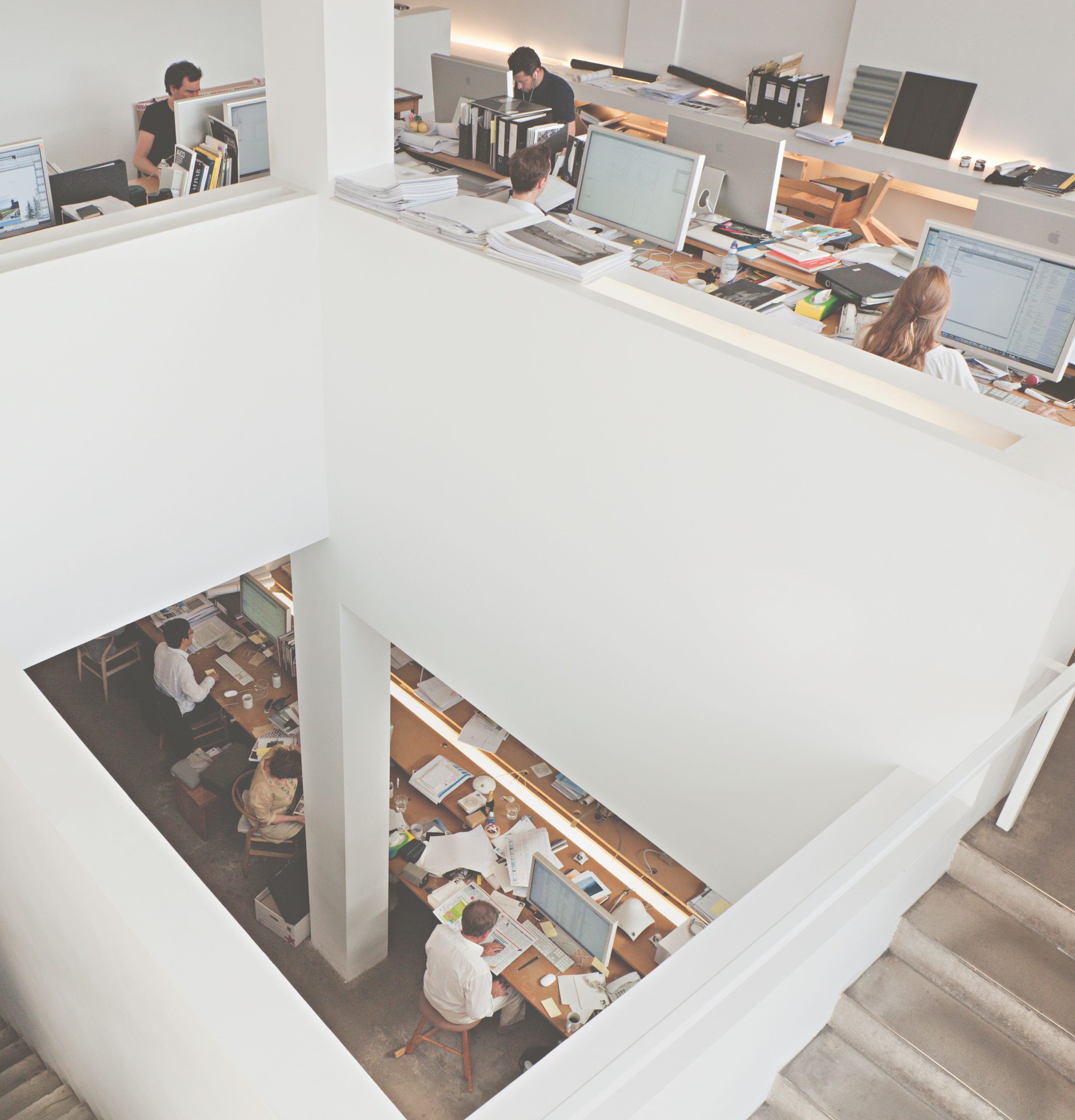
Pawson designed his London studio around the same time in the late 1990s, and today it is surrounded by shelves that house some 6,000 books that have been acquired over the years, as well as wooden maquettes and an assemblage of Pawson’s own designs, including the bentwood Tacta Chair, that sits nearby to a Cantilever chair by Mies. Much like the latter, Pawson’s practice is all-encompassing, from architecture to furniture. In what follows, Pawson discusses the essence of his approach to design, which informs every aspect of his work.
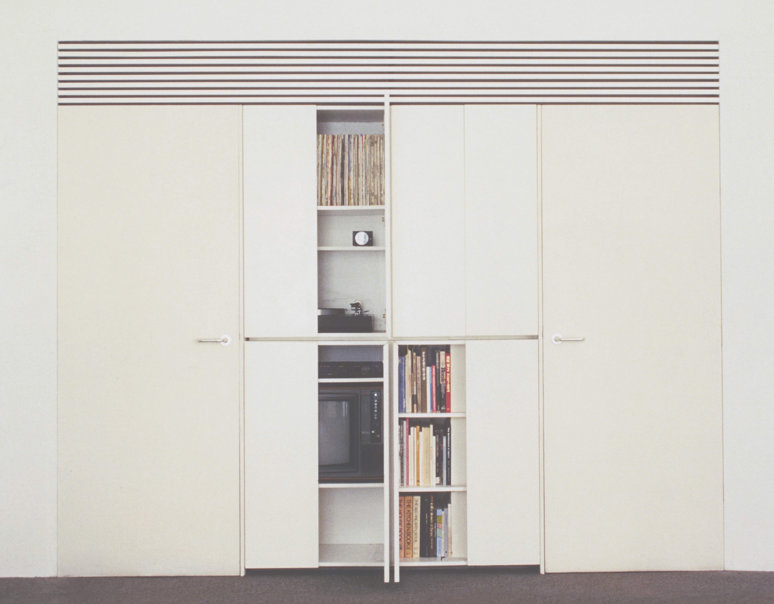
The process is less different than people might think. Which is why I always try to take clients home, to see how we live—everyone from Calvin Klein to various groups of monks and members of a parish church in Germany. Making architecture involves immersing yourself in a series of dialogues—with the client, with the site, with any existing buildings, with the intended functions. The nature of the human dialogue obviously varies, depending on how many people are involved and on the way decisions are made. But the ultimate goal of creating spaces, where a specific person or group of people will feel enduringly comfortable and at ease, is exactly the same.
If you don’t intimately understand a client’s routines and rituals, you can’t get the choreography of an architectural environment right. The choreography is sometimes quite simple and sometimes quite complicated. You don’t want to have to learn how to be in a space; you want to be able to move around in ways that feel natural and intuitive. The most intricate patterns of use I have ever had to accommodate were those of a new community of Cistercian monks, in the monastery I designed in the Czech Republic. Every step of a monk’s day is defined and ordered.
I have always been driven by the pursuit of simplicity—the quest for what I have characterised as the minimum, which is the quality an object or space has when it is no longer possible to improve it by subtraction. This act of subtraction is both an intellectual and a sensory undertaking and is a practice that has defined my entire working life. Everything I have ever done is traceable back to a consistent set of preoccupations with mass, volume, surface, proportion, junction, geometry, repetition, light and ritual. I am always trying to achieve a state of spatial clarity, where the quality of the atmosphere and the character of the light are the primary experiences. Light is crucial to the experience of all my work. Moving round my own home, the changing quality of the light is a constant sensory and emotional pleasure.
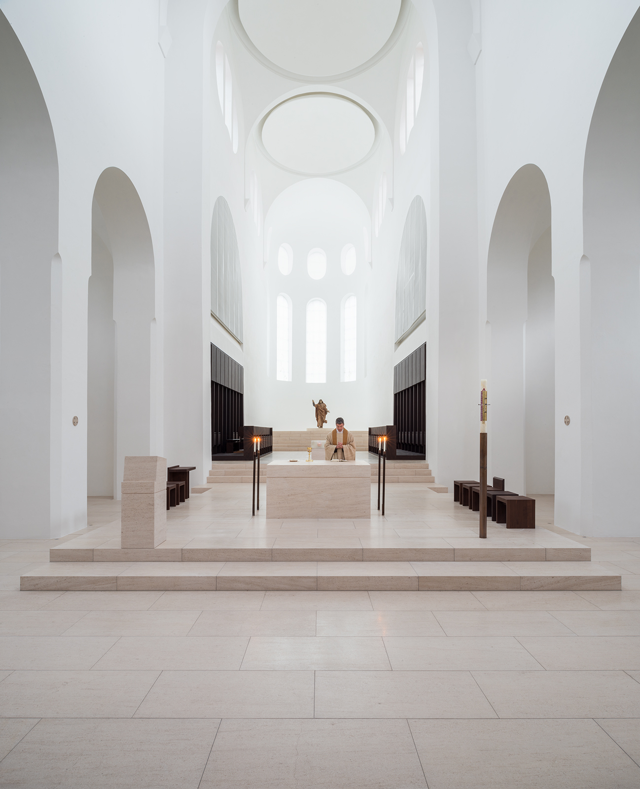
Le Corbusier said that “The home should be the treasure chest of living.” In the end, home is defined by people—by family and friends—and not by arrangements of stone, bricks and glass. At the same time, the feeling of being “at home” is very much influenced by the nature and detail of architecture. For me, a sense of ease and stillness is essential to feeling at home in a place. When you walk into a space where all of the conditions are right, the sense of quiet exhilaration is immediate and immense—for some people the reaction is a literal exhalation, accompanied by a lowering of the shoulders, as tension is released.
There are always challenges working with existing structures, but these are often what push the creative thinking. With the house in London, planning restrictions prevented us from even contemplating demolishing the facade and starting from scratch, but I love the way the past and current lives of the building coexist. The front door becomes a portal into an intensely personal universe of space and light. One of the most challenging projects I have ever worked on in these terms was the interior architecture of the new Design Museum in west London, which was created within the skin of the former Commonwealth Institute. From the beginning I said that what I wanted was for it to feel like the building had somehow retuned itself, rather than that a new set of spatial conditions had been imposed on it.
In recent years photography has become an end in itself, but it has always been an important design tool for me. I use a lens as other people use a sketchbook. Photography is a way of permanently archiving thoughts, details and experiences. I photograph the same thing a lot at home, and it’s obviously marginally different [each time]. Sometimes, I post things on Instagram and think, “Well, this is a really nice shot,” and “how original.” Then flicking back, the year before, I’ve taken the same shot. So, it started as a tool but I got interested in, I wouldn’t say the art of it, but now I’m a photographer too, by the way!
